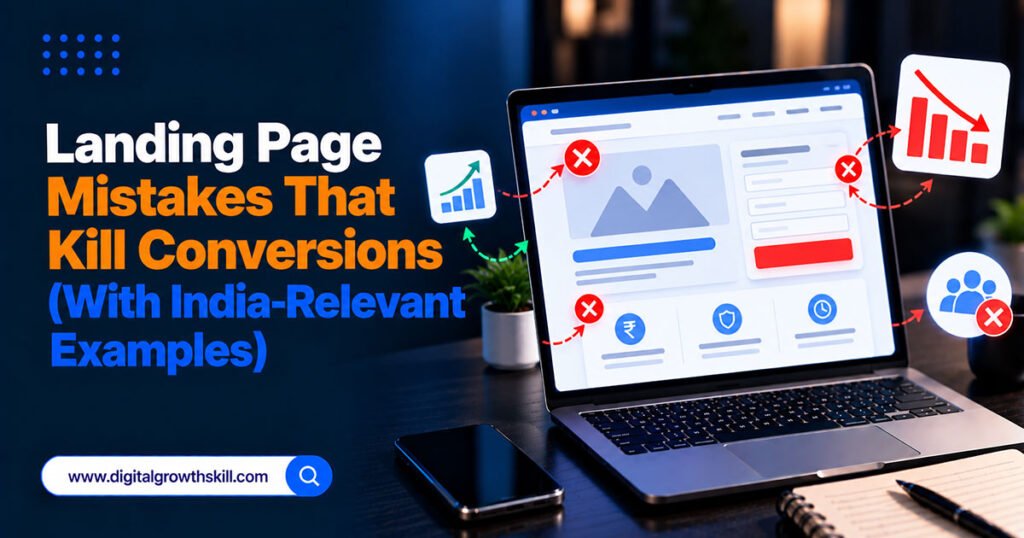
Landing page mistakes that kill conversions usually aren’t dramatic design failures — they’re small, easy-to-miss choices that quietly cost every visitor who almost converted. This guide covers the mistakes that show up most often on Indian small business landing pages specifically, alongside the generic ones every guide mentions.
Quick Answer: The most damaging landing page mistakes are sending ad traffic to a general homepage instead of a dedicated page, slow load times on mobile networks, no WhatsApp contact option for Indian visitors who prefer messaging over forms, unclear pricing or missing payment trust signals, and competing calls to action that give visitors too many choices.
Key Takeaways
- Sending paid traffic to your homepage instead of a dedicated landing page is one of the costliest and most common mistakes in Indian digital marketing specifically.
- Mobile load speed matters more in India than in many other markets, given how much traffic arrives over mid-range devices and inconsistent 4G rather than fast broadband.
- A missing WhatsApp option, not just a contact form, is a genuine conversion loss for Indian audiences.
- Unclear or missing pricing, GST, and payment method information creates hesitation that a form alone won’t overcome.
- One page, one goal — competing calls to action reduce conversions on every version of this mistake, everywhere.

Sending Ad Traffic to Your Homepage Instead of a Landing Page
A homepage is built for exploration, with navigation, multiple messages, and several competing goals — a dedicated landing page is built for one action, and sending paid traffic to the wrong one wastes ad spend before the visitor even has a chance to convert. This mismatch is flagged repeatedly as one of the most damaging patterns in Indian digital marketing campaigns specifically.
If someone clicked an ad promising a specific offer, they should land on a page about that exact offer — not a general homepage they now have to navigate themselves to find it.
Slow Load Times on Indian Mobile Networks
A landing page that loads quickly on office broadband can still load poorly for a large share of Indian visitors browsing on a mid-range Android device over 4G. Heavy, unoptimized hero images and auto-playing video are common culprits, and visitors on a patchy connection abandon a slow page before ever seeing your offer.
Compress images, avoid unnecessary auto-playing video, and test your actual load time on a throttled mobile connection, not just your office Wi-Fi.
No WhatsApp Option, Only a Form
For many Indian audiences, a landing page offering only a contact form — no WhatsApp link — is asking visitors to take an extra, less comfortable step than the one they’d actually prefer. A visible click-to-WhatsApp button alongside or instead of a traditional form often converts better, since messaging feels lower-commitment than filling out fields.
This doesn’t mean removing the form entirely for every business — it means not assuming a form is always the lowest-friction option for your specific audience.
Unclear Pricing and Missing Payment Trust Signals
Vague pricing, hidden GST, or no visible payment method information creates hesitation at the exact moment a visitor is deciding whether to proceed. Indian buyers specifically look for Cash on Delivery availability, UPI support, and clear final pricing before committing, especially on a first purchase from an unfamiliar business.
| Mistake | Why It Kills Conversions | Quick Fix |
|---|---|---|
| Ad traffic sent to homepage | No focused message, too many exits | Build one dedicated landing page per offer |
| Slow mobile load time | Visitors leave before content loads | Compress images, avoid heavy auto-play video |
| No WhatsApp option | Adds friction for a messaging-first audience | Add a visible click-to-WhatsApp button |
| Unclear pricing/GST | Creates hesitation before checkout | Show final price, GST, and accepted payment methods clearly |
| Competing calls to action | Visitor unsure what to do first | One primary CTA per page, secondary options visually smaller |
Too Many Competing Calls to Action
A landing page offering a phone call, a form, a WhatsApp chat, and a newsletter signup all with equal visual weight leaves visitors unsure which to take, and many end up taking none of them. This isn’t unique to India, but it compounds with the other mistakes above when a business adds a form and a WhatsApp button without deciding which one actually matters most for this page.
Choose one primary action, make it visually dominant, and let anything else fade into the background.
Copy That Doesn’t Match the Audience’s Actual Language
A landing page written entirely in formal English for an audience that thinks and searches in Hindi or a regional language creates a subtle disconnect, even when the visitor understands English reasonably well. This doesn’t always mean translating the whole page — sometimes it means simplifying English copy, or offering a Hindi version for a specific campaign targeting Tier 2 and Tier 3 cities.
Test this deliberately rather than assuming your usual copy style works equally well for every audience segment you’re driving traffic to.

Frequently Asked Questions
Q1. What’s the single most common landing page mistake for Indian businesses?
Sending paid ad traffic to a general homepage instead of a dedicated landing page built around the exact offer in the ad. This mismatch between promise and destination is repeatedly cited as one of the costliest patterns in Indian digital marketing.
Q2. Does landing page load speed really matter that much in India?
Yes, arguably more than in markets with more consistent broadband access, since a significant share of Indian traffic arrives on mid-range mobile devices over variable 4G connections, making a slow page a direct conversion loss.
Q3. Should every landing page have a WhatsApp button?
Not automatically for every business, but it’s worth testing for most Indian consumer-facing offers, since many visitors genuinely prefer messaging over completing a form.
Q4. Is it better to show one call to action or several options?
One clear primary call to action almost always outperforms several competing ones. If you need multiple options, make one visually dominant and the rest clearly secondary.
Q5. Do I need a Hindi version of my landing page?
It depends on your audience and where your traffic comes from. For campaigns targeting Tier 2 and Tier 3 cities specifically, testing a Hindi or simplified-English version is worth the effort; for a purely English-speaking urban audience, it may matter less.
Conclusion
Landing page mistakes that kill conversions are rarely about bad design in the obvious sense — they’re about mismatched destinations, slow mobile performance, missing the contact method your audience actually prefers, unclear pricing, and too many competing choices. Fixing the India-relevant issues here — WhatsApp access, mobile load speed, payment clarity — alongside the universal ones tends to recover conversions faster than a full visual redesign.